The Northman Poster
The Northman Poster
Info Système – Dimensions des Posters
📎 Format A3 : 29,7 × 42 cm
📎 Format A4 : 21 × 29,7 cm
🎬 À titre de comparaison, un poster A3 fait deux fois la taille d’un A4. Idéal pour rendre hommage à vos films cultes sans exploser l’espace d’affichage.
🖨️ Imprimé sur un papier de création 250g au grain fin, offrant une tenue rigide et un rendu précis des couleurs comme des contrastes. La production est réalisée en atelier en France, garantissant une finition soignée et durable.
Design_Notes
FR – The Northman Poster
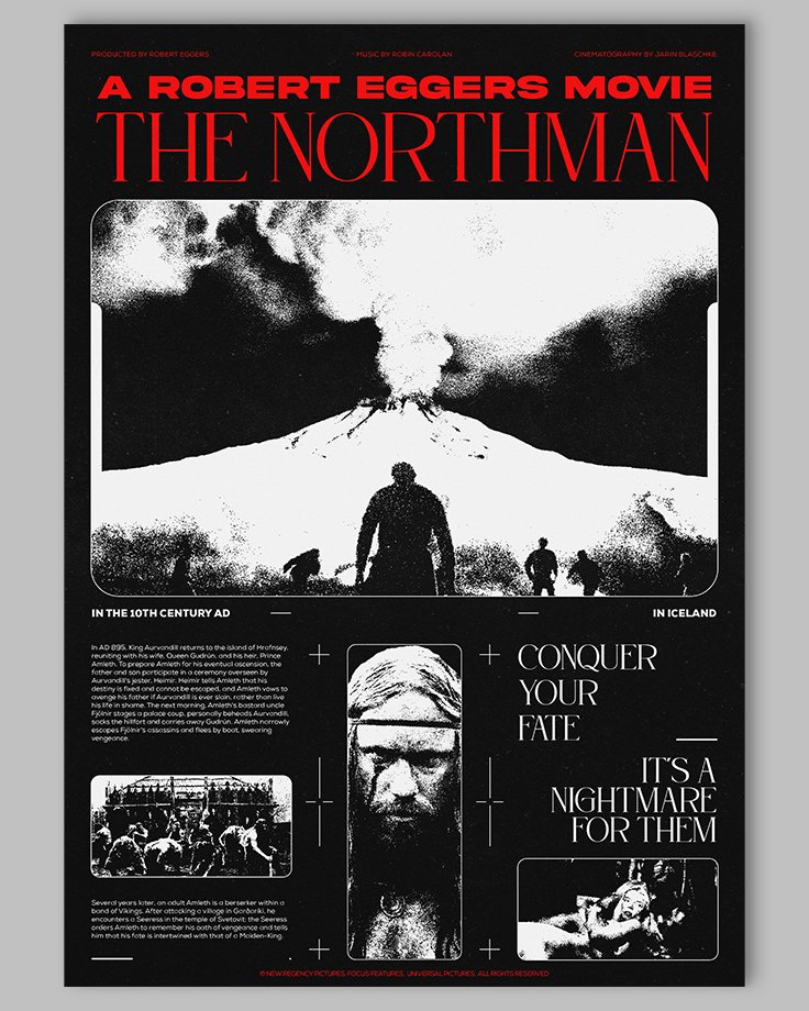
La composition de ce poster The Northman reprend les concepts utilisés sur Blade ou Moon. L’association du brutalisme avec les éléments violents du film permet de créer une ambiance lourde et pesante. La structure repose principalement sur des jeux de proportions et un quadrillage, favorisant une lecture fluide et instinctive du visuel.
L’alternance entre image brute et texte informatif stimule le regard du spectateur. Aucun point de focalisation unique n’est instauré, compte tenu de la densité des informations présentes.
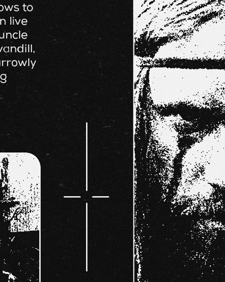
Le contraste entre le noir, le blanc et le rouge renforce la brutalité viking et l’inéluctabilité du chaos. Le grain appliqué aux éléments graphiques vient déconstruire la lecture et offre des pauses visuelles sur chaque section du poster.
Le choix de la police Saoge, anguleuse et imposante, confère à l’univers viking un caractère épique et archaïque. La typographie Nexa, plus lisible et équilibrée, vient tempérer cet effet. Enfin, Akira Expanded, avec son lettrage en blocs, contraste avec le style plus allongé de Saoge, créant ainsi une approche visuelle rigide, solide et construite.
Les versions alternatives proposent des variations chromatiques : la première oppose un rouge intense à un violet moyen, traduisant l’urgence et la violence du visuel. La version inversée offre une lecture plus chaotique et moins lisible, renforçant l’interprétation de la brutalité omniprésente dans le film.
ENG – The Northman Poster
The composition of this poster The Northman draws on concepts used in Blade or Moon. The blend of brutalism with the film’s violent elements creates a heavy and oppressive atmosphere.
The structure is based primarily on proportions and grid patterns, allowing for a natural and fluid reading of the visual.
The alternation between raw imagery and informative text stimulates the viewer’s gaze. No single focal point is established, given the density of information on the poster.
The combination of black, white, and red reinforces the Viking brutality and the inevitability of chaos. The grain applied to graphic elements helps deconstruct the reading and provides visual pauses across the poster.
The choice of the Saoge font, angular and imposing, brings an epic and archaic feel to the Viking universe. The Nexa font, with its character and readability, offers a balanced counterpart. Finally, Akira Expanded, with its block lettering, contrasts with the elongated style of Saoge, producing a visual approach that is rigid, solid, and constructed.
The alternative versions provide color variations: the first pits a vivid red against a medium-bright violet, evoking urgency and brutality. The inverted version offers a more chaotic and less readable aesthetic, encouraging deeper interpretation of the film’s pervasive violence.
Zoom


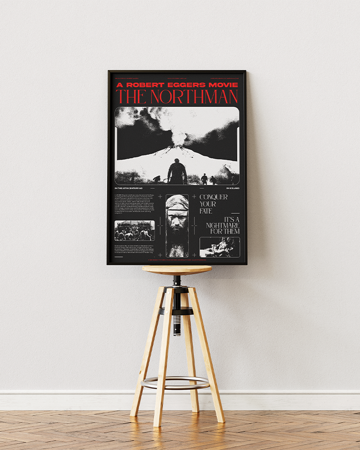
Mockup

Alternate_1

Alternate_2
