Blade Runner 2049 Poster
Blade Runner 2049 Poster
Info Système – Dimensions des Posters
📎 Format A3 : 29,7 × 42 cm
📎 Format A4 : 21 × 29,7 cm
🎬 À titre de comparaison, un poster A3 fait deux fois la taille d’un A4. Idéal pour rendre hommage à vos films cultes sans exploser l’espace d’affichage.
🖨️ Imprimé sur un papier de création 250g au grain fin, offrant une tenue rigide et un rendu précis des couleurs comme des contrastes. La production est réalisée en atelier en France, garantissant une finition soignée et durable.
Design_Notes
FR – Blade Runner 2049 Poster
Pour l’approche de ce poster Blade Runner 2049, l’objectif est similaire au poster sur First Man et Shaun of the Dead, il s’agit d’une série de trois posters ayant comme source d’inspiration un poster de Goodfellas de Martin Scorsese.
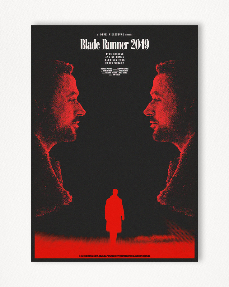
Les couleurs principales du poster principal sont le noir et le rouge, couleurs permettant d’obtenir de la profondeur via leurs contrastes et jouant sur les zones positives et négatives.
Le choix des regards, organisé sous forme rectangulaire apporte une lecture assez simple de la composition et vient s’appuyer sur le visuel des personnages principaux, présenté sous forme d’un champ laissant place à la continuité illusoire de la scène. Là où les silhouettes sont contenues, fixes et instantanées, la scène principale offre un mouvement et une apparition en positif et focalisée de la silhouette du personnage principal.
La version alternative constituée de noir et blanc offre un côté science fiction au poster, s’alignant visuellement avec le thème de film et le propos. Cela intensifie les formes constituées des silhouettes et dramatise le visuel principal.
La version alternative bleu et jaune offre un esthétisme particulier, donnant aux couleurs une signification qui ne leur est pas attribuée par nature : horreur, panique ou encore surprise.
Le choix des polices de caractère, à l’instar du projet First Man et Shaun of The Dead, est de jouer sur le côté « historique » de la font OPTIBodoni, utilisé pour Goodfellas, et de l’associer avec un genre différent : la science-fiction. Leurs agencements centraux et par block soutient la structure polygonale des autres éléments.
ENG – Blade Runner 2049 Poster
For the approach of this poster Blade Runner 2049, the objective is similar to the poster for First Man and Shaun of the Dead, it is a series of three posters having as a source of inspiration a poster of Goodfellas by Martin Scorsese.
The main colors of the main poster are black and red, colors allowing depth to be obtained through their contrasts and playing on positive and negative areas.
The choice of gazes, organized in the form of a rectangular shape, provides a fairly simple reading of the composition and is based on the visual of the main characters, presented in the form of a field giving way to the illusory continuity of the scene. Where the silhouettes are contained, fixed and instantaneous, the main scene offers movement and a positive and focused appearance of the silhouette of the main character.
The alternative version consisting of black and white offers a science fiction side to the poster, visually aligning with the film theme and the subject. This intensifies the shapes made up of the silhouettes and dramatizes the main visual.
The alternative blue and yellow version offers a particular aesthetic, giving the colors a meaning that are not attributed to them by nature: horror, panic or even surprise.
The choice of fonts, like the First Man and Shaun of The Dead project, is to play on the « historical » side of the OPTIBodoni font, used for Goodfellas, and to associate it with a different genre: the science fiction. Their central and block arrangements support the polygonal structure of the other elements.
Zoom


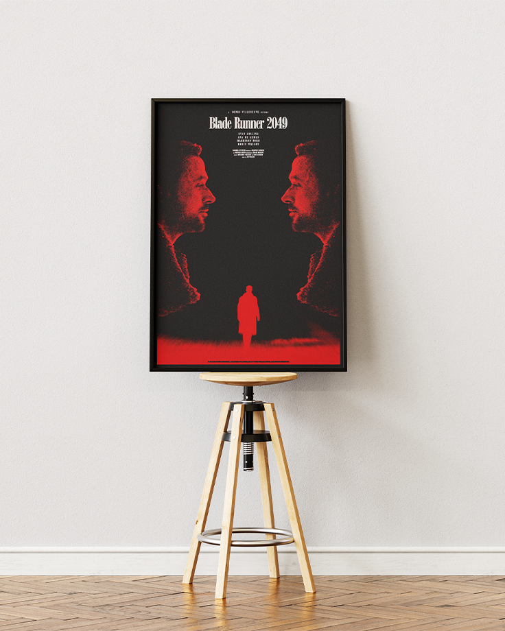
Mockup

Alternate_1

Alternate_2
