Eternal Sunshine of the Spotless Mind Poster
Eternal Sunshine of the Spotless Mind Poster
Info Système – Dimensions des Posters
📎 Format A3 : 29,7 × 42 cm
📎 Format A4 : 21 × 29,7 cm
🎬 À titre de comparaison, un poster A3 fait deux fois la taille d’un A4. Idéal pour rendre hommage à vos films cultes sans exploser l’espace d’affichage.
🖨️ Imprimé sur un papier de création 250g au grain fin, offrant une tenue rigide et un rendu précis des couleurs comme des contrastes. La production est réalisée en atelier en France, garantissant une finition soignée et durable.
Design_Notes
FR – Eternal Sunshine of the Spotless Mind Poster
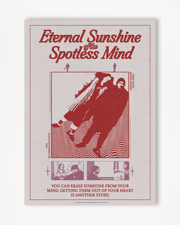
Pour ce poster Eternal Sunshine of the Spotless Mind, l’objectif est de transmettre l’intention globale et le sujet du film, le tout à travers une simplicité évidente et un style rétro, pratiquement mélancolique. L’agencement global repose sur une succession d’éléments, recentrant le sujet principal central de l’affiche via des contrastes d’échelle avec le titre, les scènes et les infos du bas du poster. Le titre, volumineux et texturé, apporte son information intrinsèque — le titre du film — et, par sa texture, un style d’impression. Son orientation italique concorde avec le mouvement d’orientation du sujet juste en dessous. Les deux petits personnages roses symbolisent la séparation des personnages et apportent une focalisation secondaire, donnant un rythme hiérarchique organique à la composition. Le sujet, les personnages côte à côte, orientés vers la droite, symbolise le décalage du film tout en gardant un mouvement de focalisation.
Les ondes collées aux personnages symbolisent à la fois le conflit dans lequel ils seront noyés et apportent un support au mouvement. Les deux scènes du bas de page apportent une stabilité méthodique au poster, mettant en scène les personnages principaux, corroborant avec les éléments supérieurs de l’affiche.
Les informations textuelles relatives au film, localisées sur le côté du carré central, se situent en fin de hiérarchie de l’affiche. Leur utilisation se concentre dans un premier temps sur l’usage de ces dernières sous forme de texture, activant les contours du carré central, puis notifie le spectateur sur le réalisateur et les acteurs.
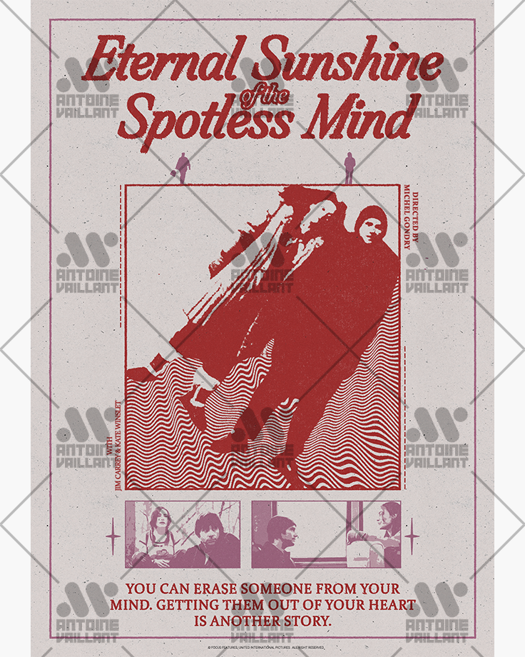
Les couleurs choisies apportent une douceur et une chaleur à la composition via l’utilisation du rouge, du rose et du violet, rassurant sur le thème de l’affiche et contrastant avec les couleurs plutôt froides du film. L’affiche alternative apporte une vision plus fantasque du film et de la composition grâce à l’utilisation de couleurs vives, saturées et contrastées par leur température. La version inversée met en exergue les relations des formes et des couleurs et apporte de la profondeur au visuel, similaire à l’exploration des pensées dans le film. Profondeur intrinsèque via la relation entre la couleur noire et les couleurs saturées.
Les polices de caractères sont choisies pour l’homogénéité du style rétro et pour leurs effets naturels, concordant avec le mouvement global de l’affiche et symbolisant la simplicité complexe des relations entre les personnages du film.
ENG – Eternal Sunshine of the Spotless Mind Poster
For this poster Eternal Sunshine of the Spotless Mind, the goal is to convey the overall intention and subject of the film, all through an obvious simplicity and a retro, almost melancholic style. The overall layout is based on a succession of elements, refocusing the central subject of the poster through scale contrasts with the title, the scenes and the information at the bottom. The title, voluminous and textured, provides its intrinsic information — the film’s name — and through its texture, adds a print-like style. Its italic orientation matches the movement of the subject just below. The two small pink figures symbolize the characters’ separation and provide a secondary focus, giving an organic hierarchical rhythm to the composition. The subject, the characters side by side, facing right, symbolizes the film’s offbeat tone while maintaining a visual focus.
The waves attached to the characters symbolize both the conflict in which they are immersed and support the direction of the motion. The two scenes at the bottom provide methodical stability to the poster, featuring the main characters and corroborating with the top elements of the layout.
The textual information relating to the film, located on the side of the central square, sits at the end of the poster’s hierarchy. Their use initially focuses on creating texture, activating the edges of the central square, then informing the viewer of the director and cast.
The chosen colors bring softness and warmth to the composition through the use of red, pink and purple, reassuring the viewer about the tone of the poster and contrasting with the film’s generally cold tones. The alternative poster offers a more whimsical vision of the film and the layout thanks to the use of bright, saturated colors, contrasted by their temperature. The inverted version highlights the relationships between shapes and colors and brings depth to the visual, mirroring the film’s exploration of memory and thought. Intrinsic depth through the relationship between black and saturated colors.
The fonts are chosen for their consistency with the retro style and for their natural visual effect, matching the overall movement of the composition and symbolizing the complex simplicity of the characters’ relationships.
Zoom


Mockup

Alternate_1

Alternate_2
