King Kong Poster
King Kong Poster
Info Système – Dimensions des Posters
📎 Format A3 : 29,7 × 42 cm
📎 Format A4 : 21 × 29,7 cm
🎬 À titre de comparaison, un poster A3 fait deux fois la taille d’un A4. Idéal pour rendre hommage à vos films cultes sans exploser l’espace d’affichage.
🖨️ Imprimé sur un papier de création 250g au grain fin, offrant une tenue rigide et un rendu précis des couleurs comme des contrastes. La production est réalisée en atelier en France, garantissant une finition soignée et durable.
Design_Notes
FR – King Kong Poster
(Le poster étant réalisé sur mesure avec un client, il possède des particularités esthétiques spécifiques aux goûts et aux demandes de ce dernier. Mon avis et mon expérience sont ici en soutien. Cela génère donc une description et une analyse plus générique.)
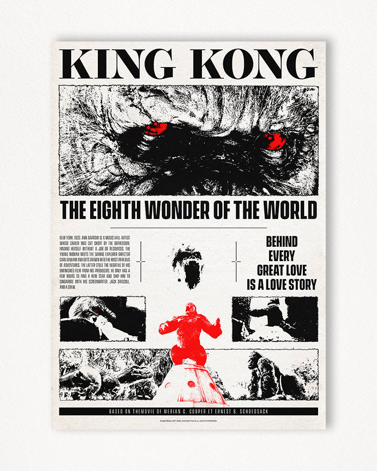
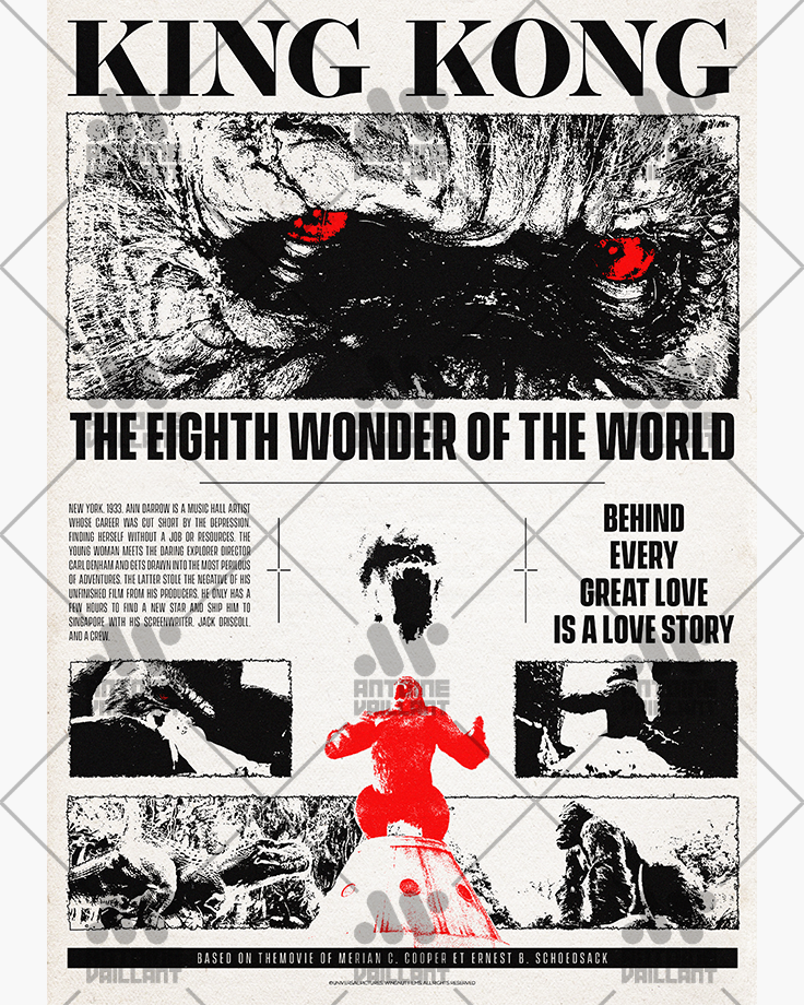
L’approche de ce poster King Kong repose sur une structure inspirée du brutalisme et du minimalisme.
L’agencement méthodique des éléments graphiques, visuels et typographiques offre une lecture simple et instinctive.
À l’instar de mes posters pour Moon ou Blade, la composition rappelle celle d’une page de journal — un choix pertinent puisque la créature devient, dans le film, une attraction traquée par journalistes et photographes.
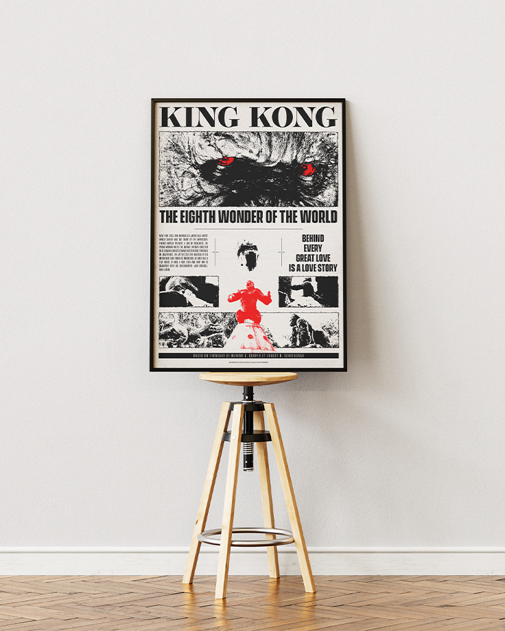
Sa structure épurée permet au poster de s’intégrer facilement dans tout type de décoration.
Les couleurs du poster principal suivent les codes du brutalisme minimaliste : noir et blanc, assurant lisibilité, adaptabilité et sobriété. L’ajout du rouge sur des zones clés (les yeux ou le personnage en bas du visuel) apporte un point de focus fort, qui contraste avec le reste de la composition et accentue la brutalité et la sensibilité du singe géant.
Le poster King Kong alternatif adopte une palette monochromatique jaune et rose, conférant un exotisme et un style volontairement anachronique, en fort contraste avec le sujet. La troisième alternative, en version inversée, apporte une interprétation plus créative et artistique.
Les polices ont été soigneusement sélectionnées : Operetta 12 Ultra Bold pour le titre, et Vanguard CF Bold & Regular pour le texte courant.
Cette association équilibre l’élégance discrète des empattements et la modernité d’une typographie longiligne. L’ensemble garantit une lecture claire, structurée, sans fioritures — priorité à l’efficacité, à l’équilibre visuel et à la lisibilité.
ENG – King Kong Poster
(The poster was created as a custom order for a client, featuring aesthetic elements specific to their tastes and requests. My input and experience here serve as support, resulting in a more general description and analysis.)
The King Kong poster’s approach is based on a structure inspired by brutalism and minimalism.
The methodical arrangement of graphic, visual, and typographic elements ensures a clear and instinctive reading.
Like my posters for Moon and Blade, the layout echoes that of a newspaper page — a natural fit given that, in the film, the creature becomes an attraction hounded by journalists and photographers.
Its simple composition allows the poster to complement any decorative setting.
The main poster adopts minimalist brutalist colors: black and white, for clarity, adaptability, and sobriety. Red accents (the eyes or the character at the bottom) create a strong focal point, contrasting with the overall composition and enhancing the brutality and sensitivity of the giant ape.
The alternative King Kong poster features a monochromatic yellow and pink palette, bringing strong stylistic and anachronistic exoticism — a bold contrast to the original design and subject. The third alternative, an inverted version, provides a more creative and artistic interpretation.
Typography was carefully chosen: Operetta 12 Ultra Bold for the title, and Vanguard CF Bold & Regular for body text.
This pairing balances subtle serif elegance with the modernity of a long, slender font — delivering a clear, structured reading experience.
No frills — just efficiency, spatial balance, and legibility.
Zoom


Mockup

Alternate_1

Alternate_2
