Moonrise Kingdom
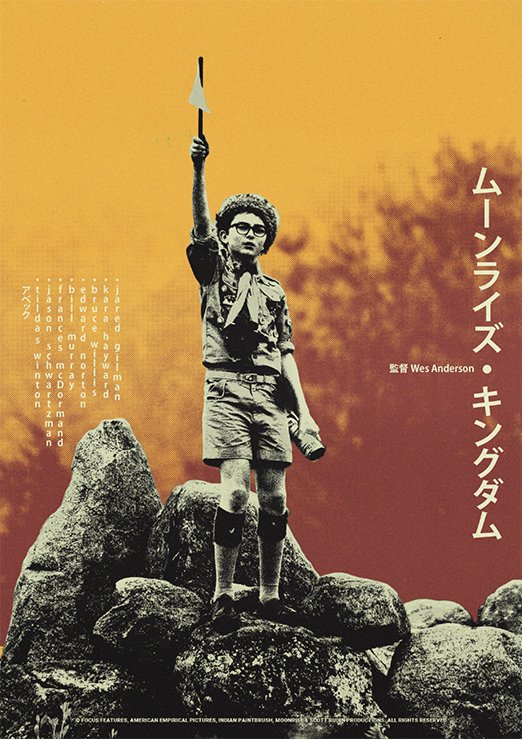
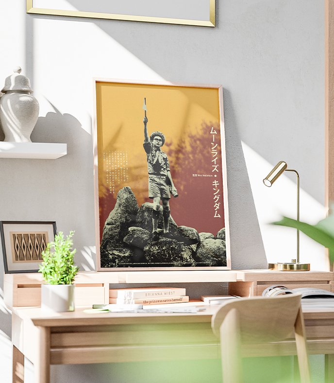
Poster Moonrise Kingdom, Film réalisé par Wes Anderson (2012).
Synopsis
Sur une île au large de la Nouvelle-Angleterre, au cœur de l’été 1965, Suzy et Sam, douze ans, tombent amoureux, concluent un pacte secret et s’enfuient ensemble. Alors que chacun se mobilise pour les retrouver, une violente tempête s’approche des côtes et va bouleverser davantage encore la vie de la communauté.
FR
Wes Anderson est une source d’inspiration évidente et accessible pour bon nombre de créatifs, que ce soit dans les arts numériques et visuels ou dans le cinéma et la photographie. Ses films sont des supports magnifiques pour accroître sa créativité et s’essayer à créer en prenant pour inspiration ses caractéristiques uniques : symétrie, harmonie des couleurs, composition simple animée par un humour et des dialogues élaborés. Sa simplicité est évidemment complexe à réaliser, mais extrêmement satisfaisante pour l’esthète qui s’amuse à admirer son travail.
EN
Wes Anderson is an obvious and accessible source of inspiration for many creatives, whether in the digital and visual arts or in film and photography. His films are wonderful tools for boosting creativity and experimenting with new forms of expression, drawing inspiration from his unique stylistic elements: symmetry, color harmony, and simple composition brought to life by humor and elaborate dialogue. His simplicity is, of course, complex to achieve, but extremely satisfying for the aesthete who takes pleasure in admiring his work.
Infos_FR.txt
Couleur et police de caractère
FR
Colors.img
Infos_ENG.txt
Color and Font
ENG
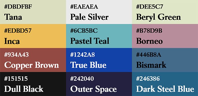
The poster’s design is based on a visual fusion of Wes Anderson’s simple composition and visual and textual elements borrowed from Japanese movie posters. These two sources of inspiration complement each other in their approach and use of color through striking contrasts and variations in brightness.
We see one of the main characters (Sam) in the foreground, rendered in a monochrome screen-printing style. In the background, trees fill the space with a blurred, halftone effect. The goal here is to maintain the viewer’s focus on the subject and then guide their attention toward the text elements arranged naturally on either side of it. The vertical orientation of these elements draws inspiration from Japanese design, and to reinforce this layout, some text is also translated into Japanese to enhance the effect.
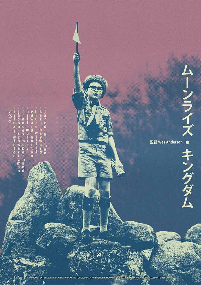
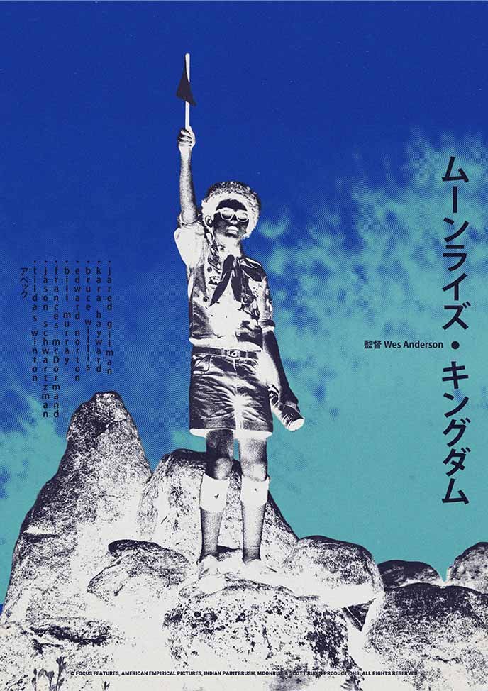
The poster comes in three color versions: an original version featuring a palette of warm, contrasting colors that create a diagonal gradation of color temperature, all set against a monochromatic backdrop of off-white and a lighter shade of black. A second version features cooler colors, ranging from purple to pink, through gray and white. Finally, an inverted version offers an artistic alternative and highlights the color characteristics mentioned earlier.
Alternate_1.img
Alternate_2.img
Exemple_1.img
Poster_Sur_Mesure.exe
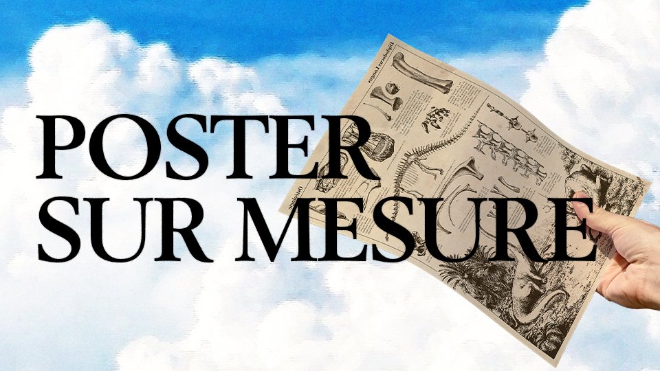

Posters personnalisés — Création sur mesure
Besoin d’un visuel unique pour votre intérieur, votre setup ou un cadeau ?
Je crée des posters inspirés de vos univers favoris, avec une direction graphique personnalisée.
Shop.exe
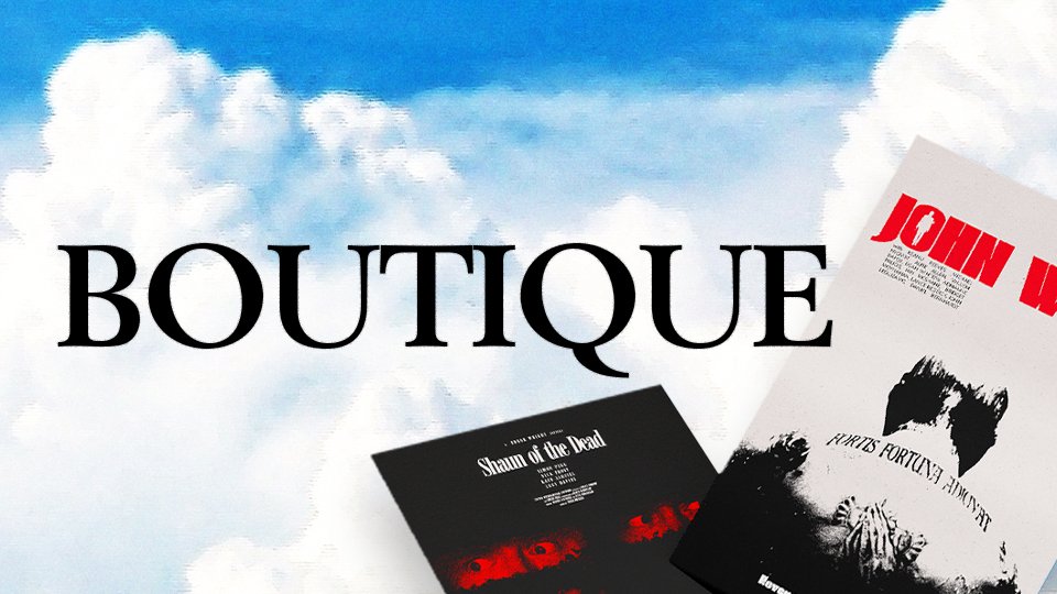

Boutique de posters
Découvrez les affiches disponibles à la vente, imprimables en A4 ou A3.
Frais de port à 1€ sur l’ensemble de la boutique.
Poster_Folio.link
Posters uniques — Sur mesure & en boutique
Découvrez les affiches créées autour de films cultes, jeux vidéo ou jeux de société.
Certaines sont des commandes personnalisées, et d’autres sont disponibles à la vente.