Shadow Sonic
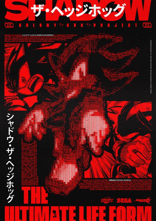
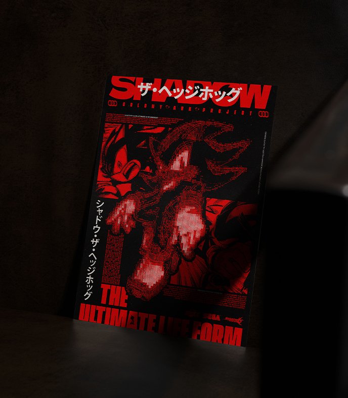
Poster Shadow Sonic, (Personnage issus du jeu vidéo : Sonic Adventure 2 (2001)
Synopsis
Sonic Adventure 2 est un jeu vidéo de plates-formes développé par Sonic Team et édité par Sega, sorti initialement sur Dreamcast en juin 2001 pour célébrer les dix ans de la franchise Sonic The Hedgehog. Le jeu fait suite au jeu Sonic Adventure et marque la première apparition dans la série des personnages de Shadow et Rouge.
FR
L’approche de ces posters est encadrée par une demande client ; les choix finaux, qu’ils soient artistiques ou structurels, reposent donc sur les envies du client. Ce poster fait partie d’un duo de réalisations reprenant l’univers de Sonic, avec un choix de personnages reposant dans un premier temps sur Shadow, puis Metal Sonic. La demande client était de faire transparaître un côté scientifique moderne « xerox » pour le poster sur Shadow (d’où le nom Project Shadow) et un poster moderne métallique mettant en avant les caractéristiques visuelles marquées de Metal Sonic.
EN
The approach to these posters is guided by the client’s request; the final decisions—whether artistic or structural—are therefore based on the client’s preferences. This poster is part of a pair of designs inspired by the Sonic universe, with the choice of characters initially based on Shadow, then Metal Sonic. The client’s request was to convey a modern, “Xerox”-style scientific aesthetic for the Shadow poster (hence the name Project Shadow) and to create a modern, metallic poster that highlights Metal Sonic’s distinctive visual characteristics.
📌 Mention : Poster réalisé sur mesure, et donc non disponible à la vente
Infos_FR.txt
Couleur et police de caractère
FR
Colors.img
Infos_ENG.txt
Color and Font
ENG
(The poster being custom-made with a client, it features aesthetic characteristics specific to the client’s tastes and requests. My input and experience here serve as support, resulting in a more general description and analysis.)
The modern scientific « pseudo » approach allows to highlight the explanatory and descriptive textual elements of the character. An ASCII effect reinforces this effect, all accompanied by a threshold effect to texture and make this set of elements, in large numbers, readable. Visual elements arranged on either side of the central character illustrate the character of the latter and offer additional visual support putting Shadow at the heart of the poster. Textual elements, such as the logo and small paragraphs, contextualize and inform about the subject of the poster. Finally, textual elements in Japanese recall the origin of this universe, which has its foundations in Japan.
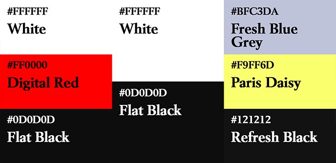
Few colors are used to ensure increased visibility with a high contrast ratio. The choice of colors is based on those sported by the character. The choice of black and red benefits from an exciting effect of red and a strong relationship with black. The choice of white pierces the poster for information and offers a structural visual reminder.
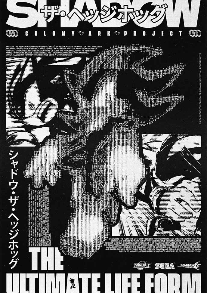
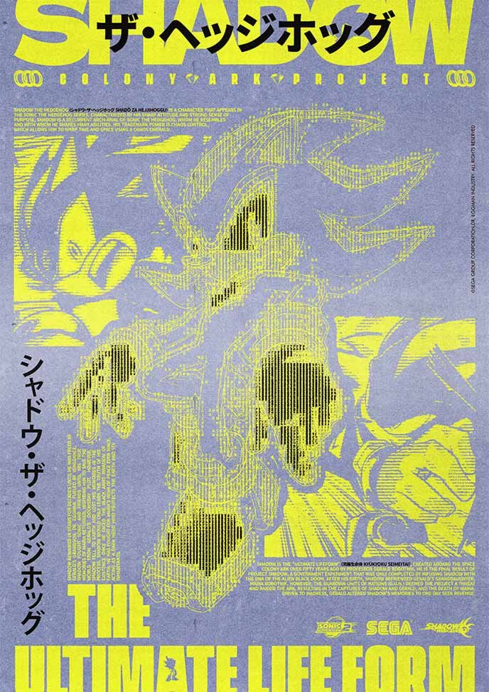
The first alternative in black and white makes it possible to visualize the poster as a whole with an equality of contrast and light. A simple, pleasant and complete reading. The alternative indeed reverse x heatmap accentuates a scientific side, dangerous limit, nuclear of the poster. This provides an alternative of marked and original color allowing to visualize the poster from another angle with more variable reading priorities.
The typographies used are serif-free, broad and full for the title, in order to keep readability with the chosen graphic style. A typography without condensed serif is chosen for the textual element at the bottom for the same reasons as the previous typography. A graphic reminder of the character is visible in the O and the A.
Alternate_1.img
Alternate_2.img
Exemple_1.img
Poster_Sur_Mesure.exe

Posters personnalisés — Création sur mesure
Besoin d’un visuel unique pour votre intérieur, votre setup ou un cadeau ?
Je crée des posters inspirés de vos univers favoris, avec une direction graphique personnalisée.
Shop.exe

Boutique de posters
Découvrez les affiches disponibles à la vente, imprimables en A4 ou A3.
Frais de port à 1€ sur l’ensemble de la boutique.
Poster_Folio.link
Posters uniques — Sur mesure & en boutique
Découvrez les affiches créées autour de films cultes, jeux vidéo ou jeux de société.
Certaines sont des commandes personnalisées, et d’autres sont disponibles à la vente.